Balance is why they open the app
So it leads every screen — large, with a one-tap toggle to hide it in public.
Self-initiated concept / Brand & Mobile UI
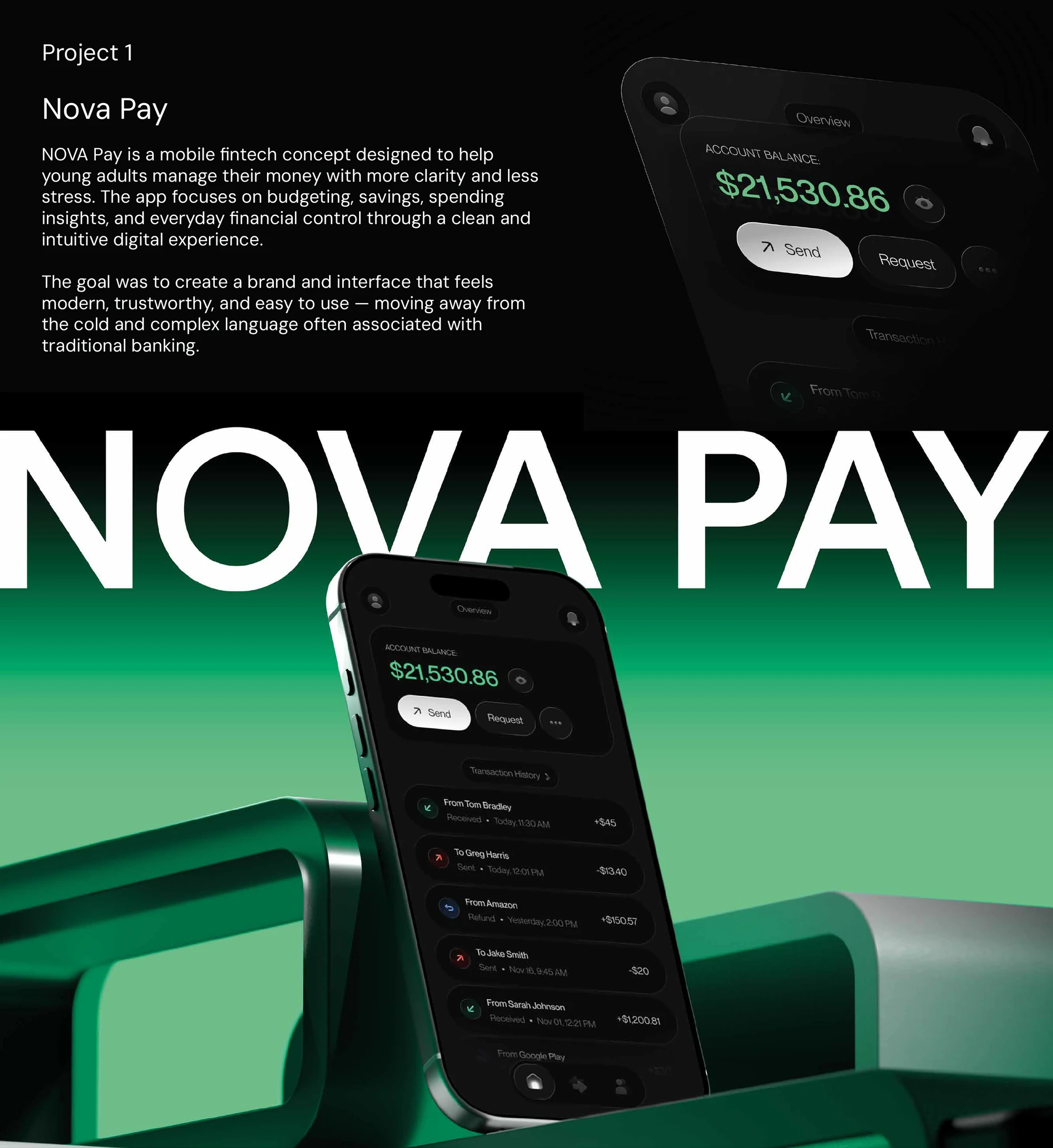
I designed NovaPay as a self-initiated mobile banking concept, covering positioning, visual identity, wireframes and a reusable interface system.
The mobile interface needed to keep balance, recent activity, transfers, analytics and savings easy to locate.
I prioritised the balance and primary actions, then used consistent transaction rows and reusable components across the remaining screens.
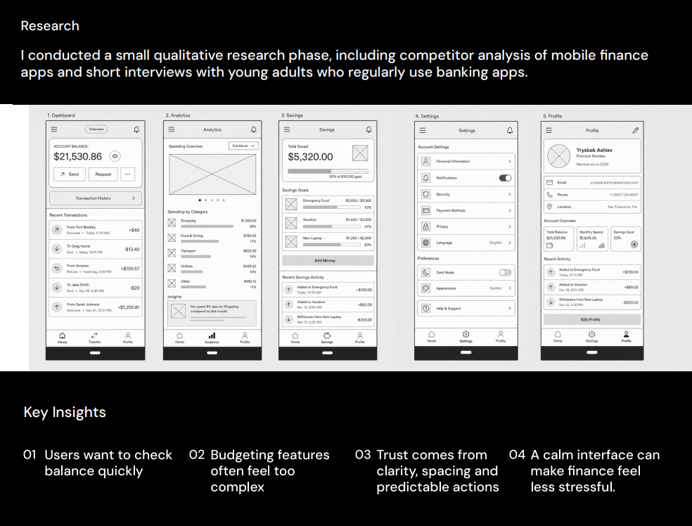
Positioning and competitor teardown, five wireframes, a visual identity, a token-based UI system and the primary dashboard.
01 / Positioning
I compared Revolut, Chase and Uber to study how they prioritise balance, actions and on-screen information. I positioned NovaPay toward the focused end of that spectrum: fewer elements per screen, one clear primary action and consistent transaction patterns.
02 / The three frictions
The teardown — plus using these apps every day myself — kept surfacing the same three frictions: the balance is what you want, but it is buried; budgeting tools feel like homework; and actions you cannot predict quietly erode trust. I made those the product's three jobs, in priority order, and wireframed a direct route through dashboard, analytics, savings, settings and profile.
03 / Insight → decision
So it leads every screen — large, with a one-tap toggle to hide it in public.
So I dropped the setup-heavy budget wizard and let passive spending insights do the work instead.
So every primary action — Send, Request — is the same labelled pill, never a mystery icon.
So dark surfaces carry the app and one green accent is reserved for money-in and the next action only.
04 / Judgement
An early direction used a colourful, category-tagged feed and a budget wizard on the home screen. It looked lively — but on review it reintroduced exactly the density I was trying to remove. I pulled colour back to a single accent, moved budgeting into passive insights, and let the balance and one action own the top of the screen. Cutting the livelier version is what made the calm one credible.
05 / Visual system
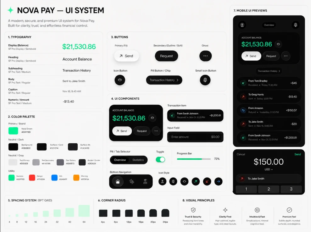
Nova Green is a functional colour, not decoration: it marks money coming in and the single action you can take — nothing else competes for it. Dark neutral surfaces carry everything else. An eight-point grid, a tight corner-radius scale and one reusable transaction row keep high-frequency data calm no matter how much of it lands on screen.
06 / Selected interface
07 / Outcome
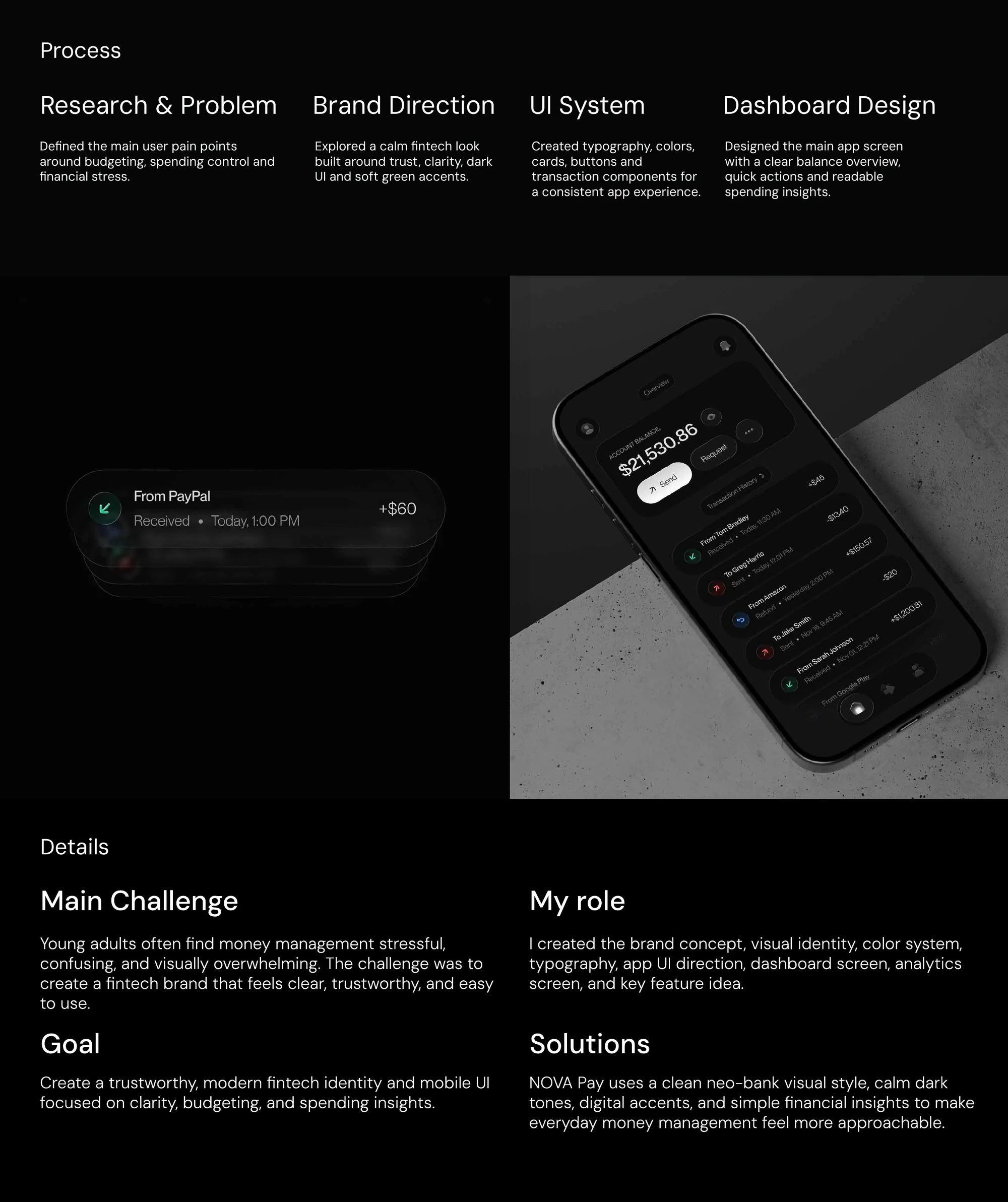
I used one green accent, one reusable transaction pattern and a dashboard that puts balance and the next action first. The visual identity and interface follow the same hierarchy.
08 / Honest status
This is a self-initiated concept — grounded in a competitor teardown and first-hand use, with no user interviews, usability testing or launch data. The obvious next step is a clickable prototype and a five-task usability test to check whether "calm" actually helps people act faster.
Interested in this kind of brand and mobile interface work?
Contact Yrysbek